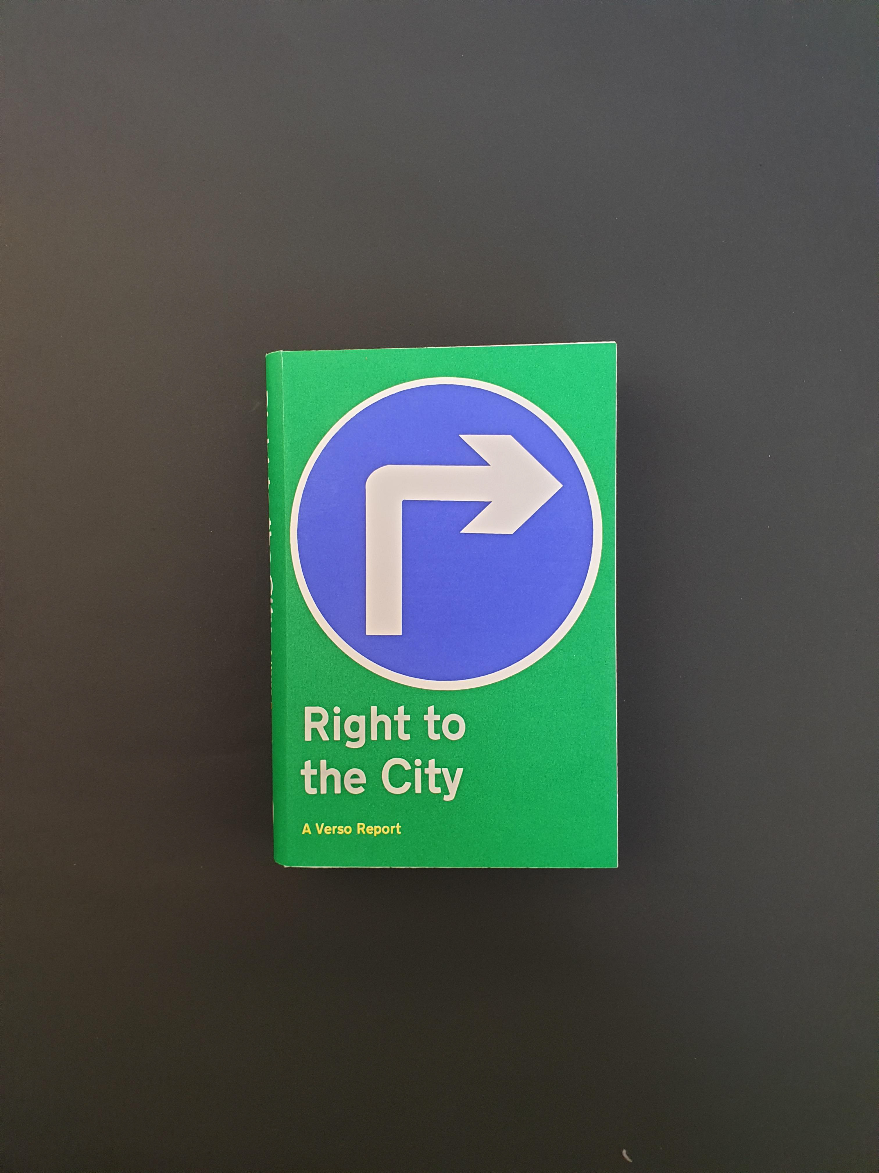
Screen printing, Book cover design.
This project required a Book-cover design. I chose to screen print for a richer tactile feel and more luminescent colour than that of a typical laser printer.
A visual pun in keeping with the theme of the book played with the visual language of street signs. The theory of semiotics informed this project work in that we are bombarded with signage and signals and therefore assume an automatic understanding, in this case- turning right, linking the title’s message of Right to the city, with the civic right of and for the city.
Reading "The Right to the City: a Verso Report" resonated with prior research and development work for 'Aspire'.